In earlier assignments I created a metric of “outdoor activity” to assess how vibrant the outdoor community of a neighborhood is. In order to gauge the relationship between my outdoor activity metric and other measurable characteristics of the city, I compared it against variables from two different datasets. The first is a collection of ecometrics created by the Boston Area Research Institute (BARI). These include measures of neighborhood growth (e.g. major developments and local investments), community involvement (e.g. citizen custodianship, as measured through calls to 311), social disorder, and more. The second is census tract data as compiled by the American Community Survey. These include demographic indicators such as breakdowns by age and ethnicity, as well as socioeconomic indicators such as median income and percentage of families in poverty by census tract. It also contains information on housing stock, such as median age of buildings and the percentage of occupied vs. vacant homes.
> #add in ecometric and demographic data
> locate <- "C:/Users/Corinne/OneDrive/classes/big data for cities/unit 3/"
> ecometrics <- read.csv(paste(locate, "CT_All_Ecometrics_2014.csv", sep = ""))
> demog <- read.csv(paste(locate, "Tract Census Data.csv", sep = ""))
The goal of this week’s assignment was to familiarize myself with two different types of statistical tests, the t-test and the ANOVA test. Both of these compare the means of outdoor activity by a categorical variable such as neighborhood type. In the BARI ecometrics dataset, there is a variable called “Type” that categorizes different census tracts based on whether they are primarily downtown, residential, parks, or institutional/industrial. However, I also wanted to analyze outdoor activity based on two categorical variables in the building permits dataset. The first of these is industry category: upper education, healthcare, religious, government, or civic. Specific permits are assigned categories instead of the census tract as a whole, but I aggregated them and assigned a category to each census tract based on the maximum number of permits of each type. For example, if a given census tract had more building permits identified as performing “religious” work than work in other industry, I designated it as a primarily religious census tract.
> #create an aggregate dataframe for industry category
> industry1 <- aggregate(uppereducation~CT_ID_10, data = permits, sum)
> industry2 <- aggregate(healthcare~CT_ID_10, data = permits, sum)
> industry3 <- aggregate(religious~CT_ID_10, data = permits, sum)
> industry4 <- aggregate(government~CT_ID_10, data = permits, sum)
> industry5 <- aggregate(civic~CT_ID_10, data = permits, sum)
> total <- as.data.frame(table(permits$CT_ID_10))
> names(total) <- c("CT_ID_10", "Permits")
> industry <- merge(industry1, industry2, by = 'CT_ID_10')
> industry <- merge(industry, industry3, by = 'CT_ID_10')
> industry <- merge(industry, industry4, by = 'CT_ID_10')
> industry <- merge(industry, industry5, by = 'CT_ID_10')
> industry <- merge(industry, total, by = 'CT_ID_10')
> rm(industry1, industry2, industry3, industry4, industry5)

> #find the most common industry category in each census tract
> industry$industryval <- NA
> for (x in 1:nrow(industry)) {industry[x,8] <- names(which.max(industry[x,2:6]))}
> industry$industryval <- ifelse(rowSums(industry[2:6]) == 0, "other",
  industry$industryval)
> #control for excessive "goverment" values
> industry$industryval <- ifelse(((industry$industryval == "government") &
+                                   (industry$government/industry$Permits >= .01)),
+        industry$industryval,
+        ifelse(industry$industryval == "government", "other", industry$industryval))
> industry$industryval <- as.factor(industry$industryval)
> table(industry$industryval)
     government     healthcare          other      religious uppereducation
             53             12             75             23             15
The table above shows the distribution of industry categories among census tracts. If the census tract had no categorized permits, or if the maximum category represented less than 1% of permits in that census tract, I labeled it as “other.” This is not the strongest aggregate variable, because the “other” category represents the highest number of census tracts. Overall only 5.9% of permits have a category assigned to them, so I do not have high hopes that this measure will have a strong positive or negative effect on the presence of outdoor activity.
The second variable that I wanted to analyze within the building permits dataset was work category. Building permits are classified as either new construction, addition, demolition, renovation, moving, or special events. Since the number of permits in each category is extremely uneven (67% of building permits are classified as renovation), I constructed a dataframe based on relative frequency. Instead of basing my aggregate measure on the number of permits concerning renovation in a given tract, I considered the percentage out of all renovation permits that happened to fall in a specific tract. The work category assigned to each census tract is the highest percentage value that fall in that census tract.
> #create an aggregate dataframe for work category
> work1 <- aggregate(newcon~CT_ID_10, data = permits, sum)
> work1[,2] <- work1[,2]/sum(permits$newcon)
> work2 <- aggregate(addition~CT_ID_10, data = permits, sum)
> work2[,2] <- work2[,2]/sum(permits$addition)
> work3 <- aggregate(demo~CT_ID_10, data = permits, sum)
> work3[,2] <- work3[,2]/sum(permits$demo)
> work4 <- aggregate(reno~CT_ID_10, data = permits, sum)
> work4[,2] <- work4[,2]/sum(permits$reno)
> work5 <- aggregate(moving~CT_ID_10, data = permits, sum)
> work5[,2] <- work5[,2]/sum(permits$moving)
> work6 <- aggregate(specialevents~CT_ID_10, data = permits, sum)
> work6[,2] <- work6[,2]/sum(permits$specialevents)
> work <- merge(work1, work2, by = 'CT_ID_10')
> work <- merge(work, work3, by = 'CT_ID_10')
> work <- merge(work, work4, by = 'CT_ID_10')
> work <- merge(work, work5, by = 'CT_ID_10')
> work <- merge(work, work6, by = 'CT_ID_10')
> rm(work1, work2, work3, work4, work5, work6)

> #find the most common work category in each census tract
> work$workval <- NA
> for (x in 1:nrow(work)) {work[x,8] <- names(which.max(work[x,2:7]))}
> work$workval <- as.factor(work$workval)
> table(work$workval)
     addition          demo        moving        newcon          reno specialevents
           13            10            31            70            29            25
The table above shows the distribution of work categories among census tracts. At this point I have created aggregate measures for both categories I am hoping to measure, so I am ready to run some statistical tests.
The first test that I run was to determine whether outdoor activity has a relationship with community engagement. Engagement is one of the ecometrics drawn from BARI’s work with the Boston CRM system (311 data), and it measures “the likelihood that an individual living in a neighborhood knows of and would be willing to use the CRM system.” I split the census tracts into two categories; those with above average engagement (>0) and those with below average engagement (<0). I theorize that the census tracts with more community engagement will also exhibit higher levels of outdoor activity.
> ## T-TESTS ##
> # 1. check outdoor energy vs. engagement
> tracts$engagement_binary <- ifelse(tracts$Engagement_2014 >= 0, 1, 0)
> t.test(OutdoorEnergy~engagement_binary, data=tracts)
         Welch Two Sample t-test

data:  OutdoorEnergy by engagement_binary
t = -0.70995, df = 171.2, p-value = 0.4787
alternative hypothesis: true difference in means is not equal to 0
95 percent confidence interval:
 -6.564327  3.091470
sample estimates:
mean in group 0 mean in group 1
       10.67094        12.40737
Unfortunately, in this case the analysis does not support my theory. While there is a slight difference between the two groups, there is almost a 50-50 chance that the +2 split in this particular dataset was due to chance. In fact, a 95% confidence interval states that the mean of outdoor activity in census tracts with more engagement could be anywhere between 6 points higher or 2 points lower than the mean of outdoor activity in less engaged census tracts.
Next I analyzed the breakdown of outdoor activity between multiple groups. The first group I examined was the “Type” variable, where census tracts are labeled as either Downtown, Residential, Parks, or Industrial/Institutional. I expect to find that downtown has the highest levels of outdoor activity, while parks have the lowest. This is due to the formulation of my metric; while parks do have a significant amount of outdoor activity, my metric is formed from building permits, and there is very little by the way of investments or physical changes in a park that requires a building permit. Therefore, my metric does not effectively capture the energy of parks and thus this category will be lower than the others.
> ## ANOVA TESTS ##
> # 2. check outdoor energy vs. Type
> anova<-aov(OutdoorEnergy~Type, data=tracts)
> summary(anova)
             Df Sum Sq Mean Sq F value  Pr(>F)
Type          3  10741    3580    15.7 4.4e-09 ***
Residuals   174  39670     228
---
Signif. codes:  0 ‘***’ 0.001 ‘**’ 0.01 ‘*’ 0.05 ‘.’ 0.1 ‘ ’ 1

> TukeyHSD(anova)
  Tukey multiple comparisons of means
    95% family-wise confidence level

Fit: aov(formula = OutdoorEnergy ~ Type, data = tracts)

$Type
           diff       lwr        upr     p adj
I-D -17.9491040 -31.26578  -4.632424 0.0033253
P-D -28.7113339 -44.12001 -13.302661 0.0000174
R-D -28.5385528 -40.39285 -16.684258 0.0000000
P-I -10.7622299 -23.37454   1.850079 0.1236046
R-I -10.5894488 -18.47408  -2.704816 0.0034698
R-P   0.1727811 -10.88437  11.229936 0.9999760

> #graph outdoor energy vs. Type
> require(reshape2)
> require(ggplot2)
> melted<-melt(tracts[c(42,14)],id.vars=c("Type"))
> means<-aggregate(value~Type,data=melted,mean)
> names(means)[2]<-"mean"
> ses<-aggregate(value~Type, data=melted, function(x) sd(x,
  na.rm=TRUE)/sqrt(length(!is.na(x))))
> names(ses)[2]<-'se'
> means<-merge(means,ses,by='Type')
> means <- transform(means, lower=mean-se, upper=mean+se)
> levels(means$Type)<-c("Downtown","Industrial/Institutional","Park","Residential")

> ggplot(data=means, aes(x=Type, y=mean)) +
+   geom_bar(stat="identity", position="dodge", fill="blue") + ylab("Mean") +
+   geom_errorbar(aes(ymax=upper, ymin=lower), position=position_dodge(.9))
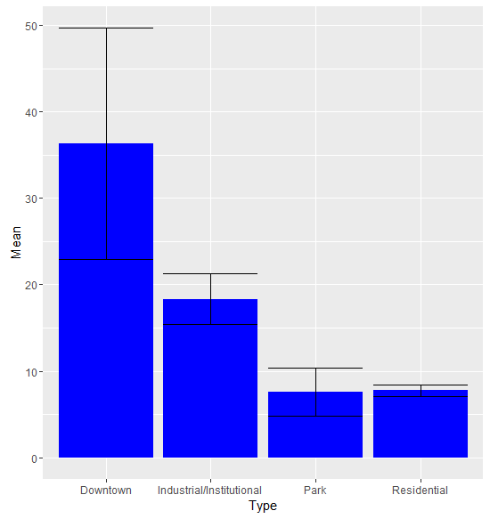
The ANOVA test shows a significant difference in outdoor activity between the types, and a Tukey’s test comparing categories individually mostly supports my hypothesis. Downtown census tracts have higher levels of outdoor activity than any of the other categories. Industrial/institutional areas have higher outdoor activity than residential areas and a non-significant difference between parks. Residential areas and parks are essentially tied. Moderately high levels of outdoor activity in industrial/institutional areas makes sense, as these census tracts contain the universities of the city, and many of those hold outdoor events regularly.
The graph also points out some key differences between the categories that the Tukey’s test does not, namely regarding their levels of variation. The census tracts that are classified as downtown areas have a wide range of outdoor activity levels. Conversely, residential areas are extremely consistent in their levels of outdoor activity. This could be due to actual variation or due to the number of cases; since there are less downtown census tracts, the uncertainty surrounding the results is much higher.
I also want to determine whether significant differences exist between the industry categories.
> # 3. check outdoor energy vs. industryval
> anova<-aov(OutdoorEnergy~industryval, data=tracts)
> summary(anova)
             Df Sum Sq Mean Sq F value Pr(>F)
industryval   4   1938   484.6   1.729  0.146
Residuals   173  48473   280.2

> #graph outdoor energy vs. industryval
> melted<-melt(tracts[c(90,14)],id.vars=c("industryval"))
> means<-aggregate(value~industryval,data=melted,mean)
> names(means)[2]<-"mean"
> ses<-aggregate(value~industryval,data=melted, function(x) sd(x,
  na.rm=TRUE)/sqrt(length(!is.na(x))))
> names(ses)[2]<-'se'
> means<-merge(means,ses,by='industryval')
> means <- transform(means, lower=mean-se, upper=mean+se)

> ggplot(data=means, aes(x=industryval, y=mean)) +
+   geom_bar(stat="identity", position="dodge", fill="blue") + ylab("Mean") +
+   geom_errorbar(aes(ymax=upper, ymin=lower), position=position_dodge(.9))
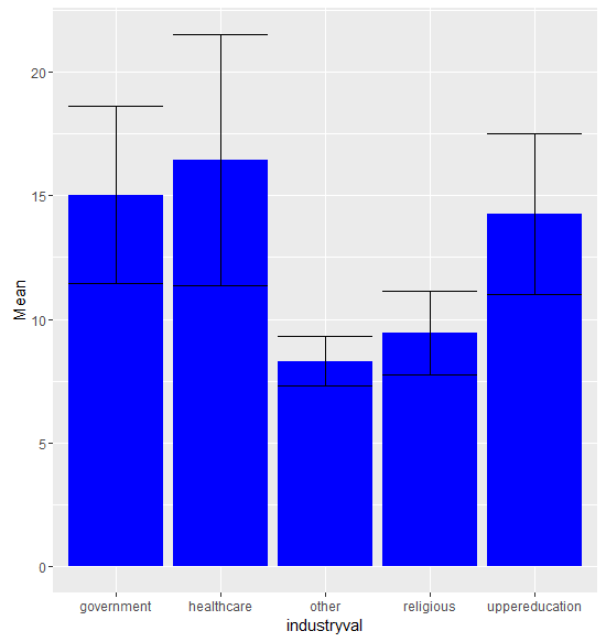
The graph shows some slight differences between the levels of outdoor activity in each of the industries. Unfortunately, the 14% probability that the differences between categories is due to chance renders our findings insignificant. The significant overlap between many of the standard error bars also indicates that a statistical test on a separate sample of data would yield divergent results.
The last categorical variable I want to examine are the work categories.
> # 4. check outdoor energy vs. workval
> anova<-aov(OutdoorEnergy~workval, data=tracts)
> summary(anova)
             Df Sum Sq Mean Sq F value     Pr(>F)
workval       5   8732  1746.5   7.207 0.00000377 ***
Residuals   172  41679   242.3
---
Signif. codes:  0 ‘***’ 0.001 ‘**’ 0.01 ‘*’ 0.05 ‘.’ 0.1 ‘ ’ 1

> TukeyHSD(anova)
  Tukey multiple comparisons of means
    95% family-wise confidence level

Fit: aov(formula = OutdoorEnergy ~ workval, data = tracts)

$workval
                              diff         lwr       upr     p adj
demo-addition           25.9921373   7.1210644 44.863210 0.0014579
moving-addition          5.9544424  -8.8699931 20.778878 0.8561303
newcon-addition          1.3572054 -12.1922768 14.906688 0.9997264
reno-addition            0.3633778 -14.6113288 15.338084 0.9999998
specialevents-addition  14.8501525  -0.4908757 30.191181 0.0639081
moving-demo            -20.0376949 -36.3537600 -3.721630 0.0067365
newcon-demo            -24.6349319 -39.8019541 -9.467910 0.0000835
reno-demo              -25.6287595 -42.0814775 -9.176042 0.0001873
specialevents-demo     -11.1419848 -27.9288022  5.644833 0.3977999
newcon-moving           -4.5972370 -14.2763413  5.081867 0.7455209
reno-moving             -5.5910646 -17.1815101  5.999381 0.7328383
specialevents-moving     8.8957101  -3.1642955 20.955716 0.2789618
reno-newcon             -0.9938276 -10.9015523  8.913897 0.9997245
specialevents-newcon    13.4929471   3.0397984 23.946096 0.0036116
specialevents-reno      14.4867747   2.2425237 26.731026 0.0103403
This time the p-value is vanishingly small, indicating that any distinctions between categories are far more likely to be due to actual differing levels of outdoor activity than chance. When we examine the direct relationships individually, we find that census tracts with high levels of demolition have significantly more outdoor activity than those with a high percentage of building permits indicating addition, moving, new construction, or renovation. Census tracts with a high percentage of special events permits had more outdoor activity than census tracts with a high percentage of new construction or renovation permits. These are interesting findings, but not the most useful. In future assignments, I can dig deeper into the types of work being described to find a logical explanation for each of these results.
Since census tract type was the most informative categorical variable, let’s return there for the last portion of my analysis. The outdoor activity metric was formulated by combining the effects of two types of energy: informal interactions and formal events. Informal interactions are measured from building permits that indicate street-level additions and renovations that improve the outdoor experience, such as the installation of shade awnings or the addition of new outdoor seating. Formal events are permitted outdoor community gatherings, such as a cultural festival, road race, or outdoor concert series. My goal is to see how the levels of formal vs. informal permits compare across the different neighborhood types.
> # graphing formal vs. informal
> melted<-melt(tracts[c(7, 13,42)],id.vars=c("Type"))
> means2<-aggregate(value~Type+variable,data=melted,mean)
> names(means2)[3]<-"mean"
> ses2<-aggregate(value~Type+variable,data=melted, function(x) sd(x,
  na.rm=TRUE)/sqrt(length(!is.na(x))))
> names(ses2)[3]<-'se'
> means2<-merge(means2,ses2,by=c('Type','variable'))
> means2<-transform(means2, lower=mean-se, upper=mean+se)
> levels(means2$Type)<-c("Downtown","Industrial/Institutional","Park","Residential")
> levels(means2$variable)<-c("Informal Interactions","Formal Events")

> ggplot(data=means2, aes(x=Type, y=mean, fill=variable)) +
+   geom_bar(stat="identity", position="dodge") +
+   geom_errorbar(aes(ymax=upper, ymin=lower), position=position_dodge(.9)) +
+   ylab("Mean") + theme(axis.text.x = element_text(angle = 45, hjust = 1))
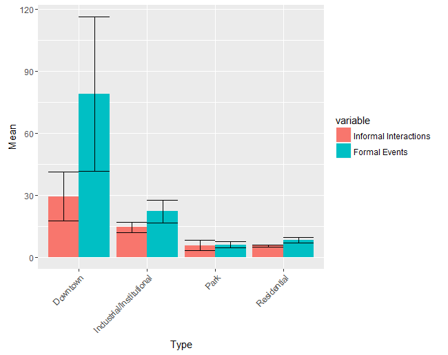
As you can see, disaggregating the effects of formal vs. informal indicators on my overall metric does not make much of a difference in parks, residential areas, or even in industrial/institutional areas. In downtown areas, however, the mean number of permits indicating formal events is significantly larger than the mean number of permits indication informal interaction. It also exhibits far more variation; the standard error of formal events in downtown areas is 37.3, well over the standard error of informal events (11.8). No other standard error tops 10. This visualization offers us some insight into the potentially skewing effect of formal permits in downtown areas.
