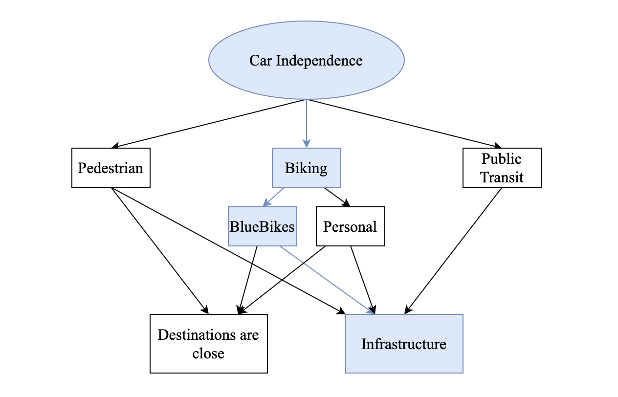
This data exploration attempts to measure the improvements made to a bike lane by observing the BlueBikes usage over a long time frame. The intent is to infer that changes in Biking behavior/usage lead to changes in car usage. Last week I proposed that Car independence is a latent construct of bike usage and that improvements to infrastructure would incentivize more people opting to bike. This is a difficult topic to quantify especially when I am only looking at data for a small piece of the puzzle.
Overview of a case study
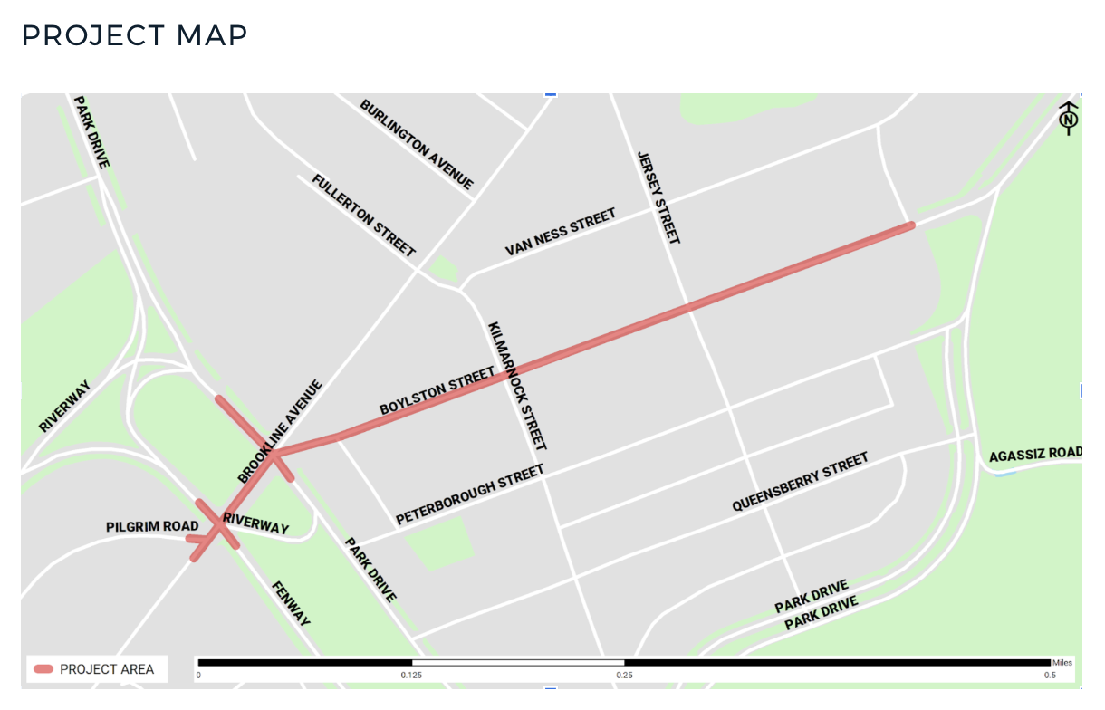
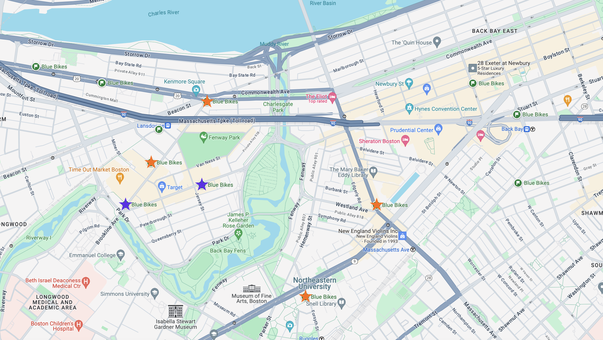
Using a case study is very useful as it filters down the dataset so that reasoning through possible biases that exist in the full dataset is made easier. To measure the effects of bike lane improvements, I chose the Boylston Street changes as it was completed recently (which is a requirement to have more reliable data to work with). The project site provides a map showing the roads which where worked on:
For this case study I will analyze the usage of a select few stations before and after the construction of the bike lane. I will also compare the usage to the overall trend of BlueBikes as I must take into account the general increase of biking.
Analysis
Using the provide project map and google maps, I found there are 2 stations along the portion of roads that were improved on:
- Boylston St at Jersey St
- Landmark Center – Brookline Ave at Park Dr

My dataset currently only contains data for 2023, this will be insufficient as the project website indicates that some changes were made in 2022 and upon further research I found possible conflicting timelines:
- The Action plan for this project specifies that quick bike lanes were added in 2022.
- According to the mass.streetsblog.org the quick build lanes were started in the fall of 2021.
I think the best path forward would be to load in additional data so that the dataset contains the years 2021, 2022, and 2023 and then compare usage year to year. To measure the effects of these improvements I should look at the usage between 2021 and 2023 for these 2 stations with the usage for all stations.
Loading in more data
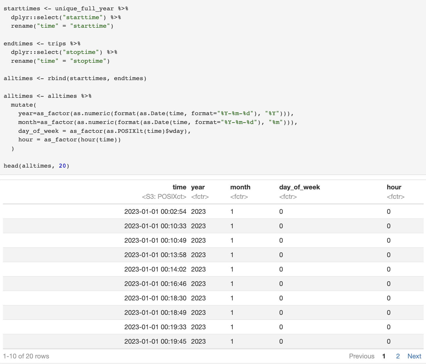
Luckily loading data in is quite simple due to the functions I created a few weeks ago. I downloaded the 24 files for 2021 and 2022 from s3 and ran the following R chunks:


I then added a new variable year to my time conversion table so that I can perform aggregations later on:
Back to the analysis!
I wanted to see the trend of usage by aggregating the data for those 2 stations by month, the following chunk shows this calculation. I also perform the same aggregation for the full dataset as a comparison. Note I need to mutate the date variable so that month is always 2 digits to enforce correct ordering, I also converted it to type factor to make plotting easier.

Using geom_bar I visualized these data:
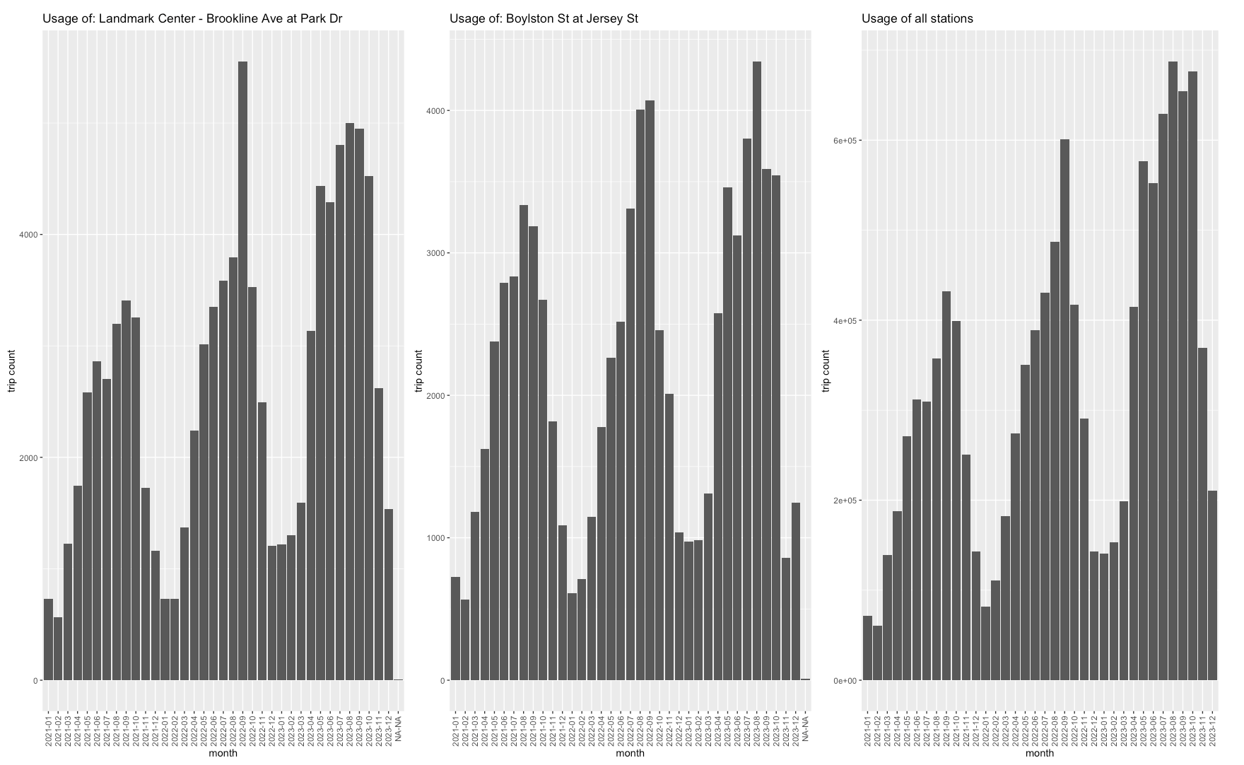
This is very interesting, I definitely do see an increase of usage of these 2 stations year to year. However, this does not necessarily stand out compared to the usage of BlueBikes across all stations. I did expect to see less usage during the time of the construction of the lanes, however I don’t notice any major dip in usage. This may indicate that the construction was less disruptive to the general usage of the roads (Go construction teams!). I do however see an outlier: the usage of “Landmark Center – Brookline Ave at Park Dr” during the month 2022-09, what happened to cause such a spike? Could it be fall ball (baseball), start of semester, something else? I am seeing that month also has elevated usage across all stations.
Just a small detour
I wanted to explore the month of 2022-09 further. I replotted the bar graph for station “Landmark Center – Brookline Ave at Park Dr” and all stations again but with a reduced dataset of August-October of 2022. I also colored the bars by the day of week to highlight weekends:

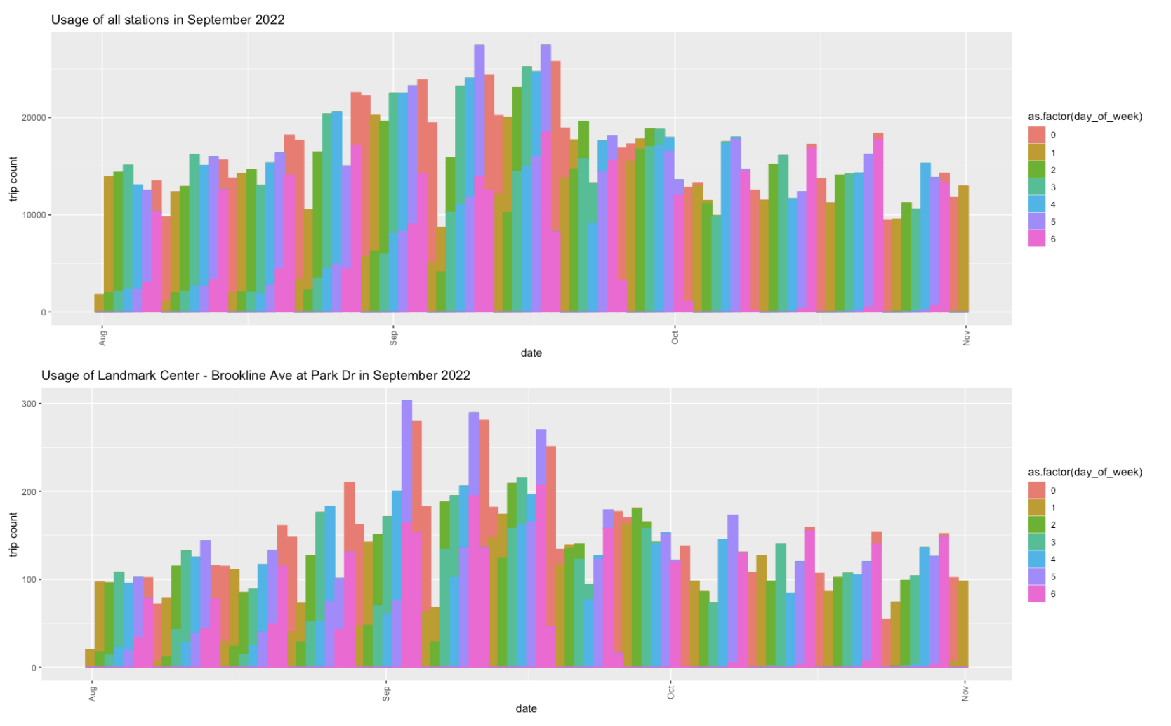
Its not easy to read but I do see the first 3 Saturday’s have elevated bike usage at station: “Landmark Center – Brookline Ave at Park Dr”. And the first Saturday has more usage than what we might expect from the overall trend. Since this is weekend usage I could see this being caused by sports events!
I do find it curious that this elevation was especially prominent to 2022. I am not sure what was special about that specific time in Boston.
Going back to the Boylston case study, I think it will be useful to revisit the map and consider additional stations. I chose (seen as orange stars on the map):
- 2 stations along Brookline Ave
- 2 stations that have a direct path to the park near the bike lanes
I re-plotted the bar graphs using the same aggregation calculation as before:

From these graphs we can see that:
- “Forsyth St at Huntington Ave” was opened at the end of 2021, which would be after the construction of the lanes. So I will ignore this station moving forward.
- “Burlington Ave at Brookline Ave” was closed during the winter months, however there is elevated usage in 2022. I think this is fine as the closures are consistent across years.
I am again seeing 2022-09 standing out. After thinking about this more and looking at Google maps, I noticed that this is the location of our very own Northeastern University! Maybe this spike could also be due to the start of semester (post COVID), however it is not present in other years.
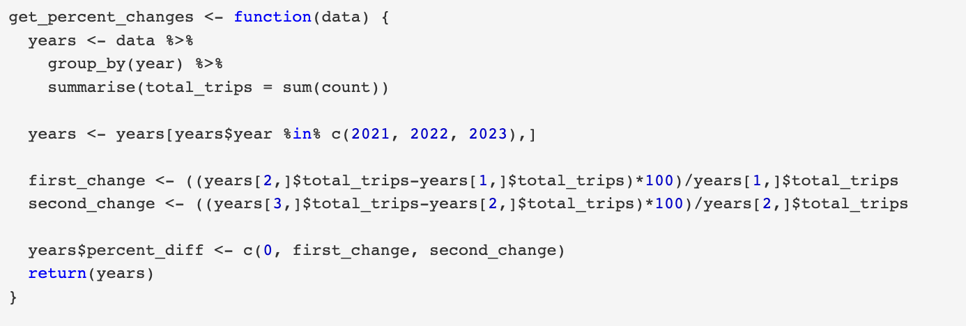
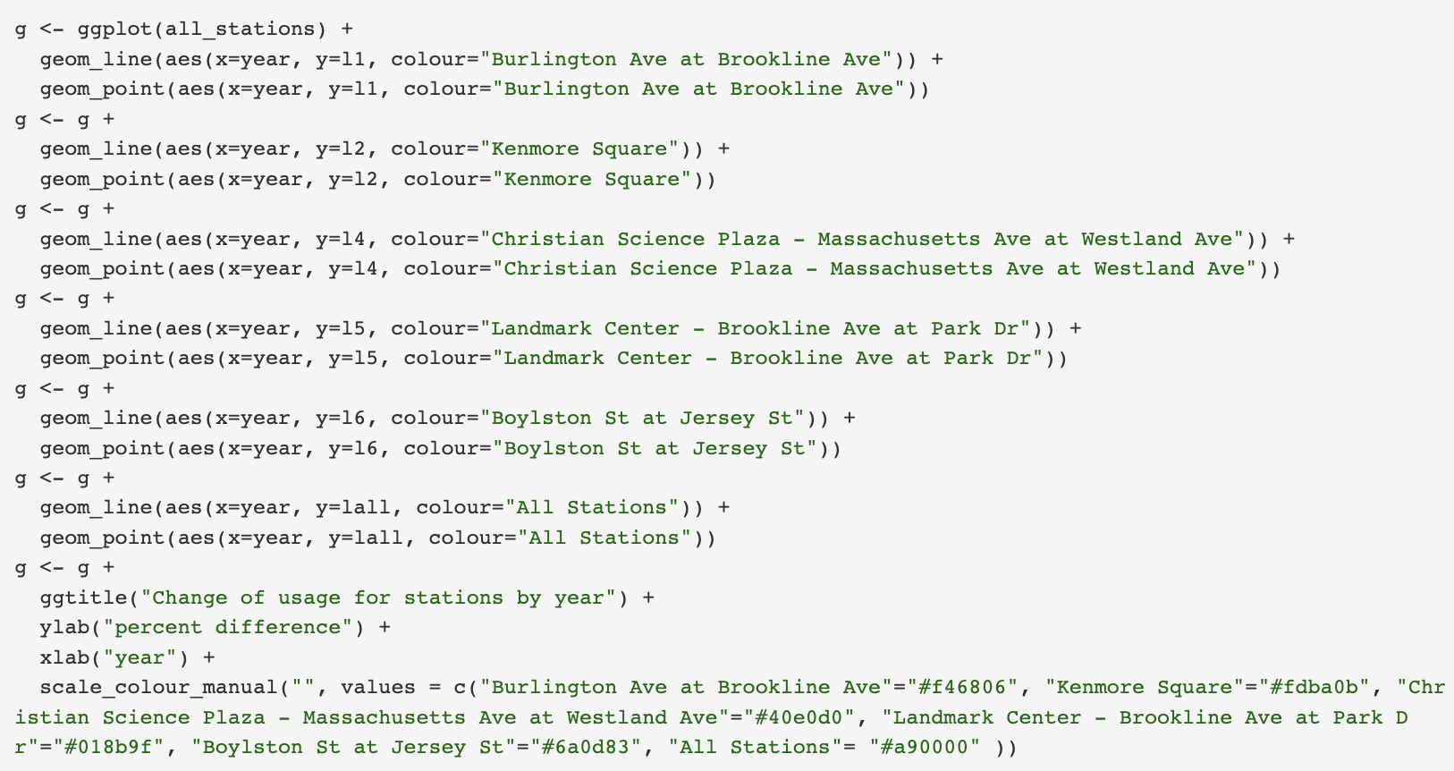
These trends have been useful and show a clear increase of usage year to year. However to compare the stations to the overall BlueBikes trend I think it is more helpful to compute the % increase year to year. This should show a clearer picture of station performance during this time frame. To do this I created a function get_percent_change that performs this calculation and returns the table with an additional column. I then created a table with the percent changes for all units of comparison:

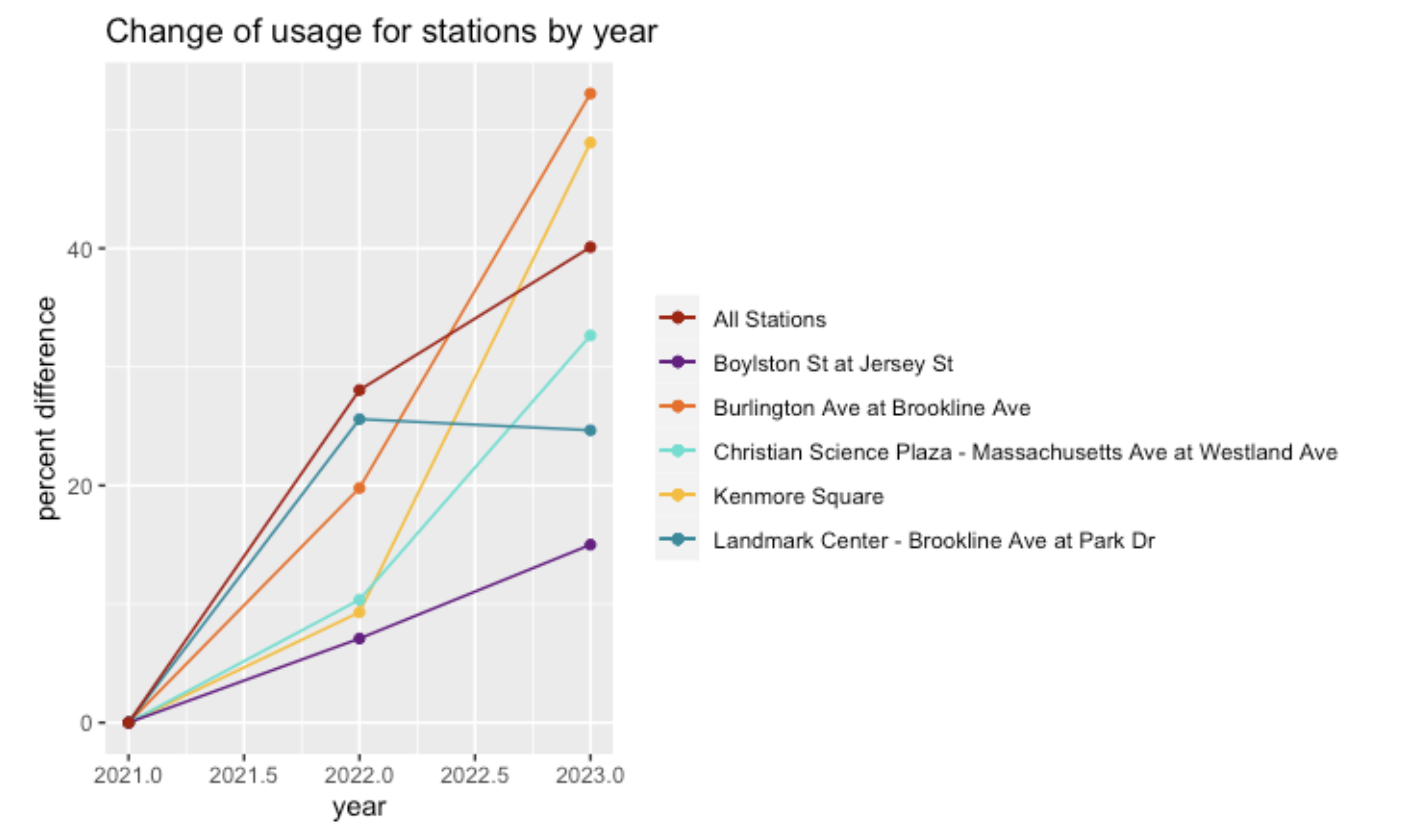
First I’d like to point out the Overall BlueBikes usage, 40% increase year-to-year is incredible!
This plot clearly shows that the selected stations for this case study all had an increase in usage, but particularly the following observations are relavant:
- “Burlington Ave at Brookline Ave” and “Kenmore Square” out performed the general trend!
- “Landmark Center – Brookline Ave at Park Dr” 2023 increase was slowed as compared to 2022. This is a little disappointing.
- “Boylston St at Jersey St” had the lowest year to year increases.
Interpretation
Out of the 5 nearby stations to the Boylston improvements, 2 outperformed the overall BlueBikes trend. The 2 stations along the improvements unfortunately performed the worst. I think this would be helpful to visit during the next city walk as I suspect that I am missing something important here.
I think that re-doing this analysis with a few changes is necessary before concluding that these data show no evidence to support the development of bike infrastructure:
- The full dataset with all stations should be reduced to only those that were opened BY 2021-01. The comparison I made in the plots may be unfair due to newer stations contributing to the general increase.
- Performing an additional comparison of stations within the neighborhood of the Boylston improvements with those NOT in the neighborhood. I think it would be useful to separate possible usage trends into distinct sets.

I am also analyzing the Bluebikes data and am so impressed by how much you are seeing in this data! Your coding decisions and visualizations breathe so much life into it. Bravo!
LikeLiked by 1 person
Hi Emma,
This is a great post. I worked with a different data set, so your post made it easy to understand your dataset. The visualization also helped me identify the most popular stations and also the months with the most activity. Good job on your post.
LikeLike